Monday, June 16, 2014

San Antonio Spurs are NBA Champions!!!

Click the image to watch the Spurs recap video.

I hope we can start talking about how amazing the Spurs were this year and stop making this all about how LeBron or anyone else on the Heat blew it!

As basketball fans don't we want a team full of solid role players rather then superstars to play the closest thing we've ever seen to perfect basketball, under a coach as genius and inspiring as Popovich?

Why are so many basketball fans denying themselves the moment that is now? This is the moment the NBA and all of sports has needed desperately in this age of hundred million dollar contracts and larger then life egos…  A group of individuals playing as a true TEAM, selfless and trusting in their execution and ultimately defeating the three-headed seemingly unbeatable monster.

As someone who had been previously down on NBA basketball these past couple of years, this year I have been renewed and reassured that I still deeply and truly love this game!

Congrats to the San Antonio Spurs. To me what you have done in these 2014 NBA Finals is even greater that what other teams have done to receive the same honor. Just. Wow.


Since this is a design blog after all, check out friend of Sportofdesign.com, Senior Sports designer Rusty Morris' "NBA Champions" Tervis Tumblers that shipped this morning.  They look amazing! Save me one, Rusty!

Saturday, June 14, 2014

Outstanding blog features college football posters and more

Image referenced from Sportposterswag.wordpress.com.


SportsPosterSwag is a blog about all things college football design with a focus on posters! If you are a fan of sports and a fan of design, then you understand the level of awesome a beautifully designed college football poster can reach. These are some of the most collectable and cherished design pieces in sports as they hang proudly in places from dorm rooms to Dr.'s offices.

This site is where you can find the very best as they are released.

http://sportposterswag.wordpress.com


Be sure to follow them on Twitter too!

Friday, June 13, 2014

This Johnny Football logo by Senior Sports Designer Rusty Morris is perfect

My good friend and amazing sports creative Rusty Morris got approvals on this Johnny Football logo this week. Congratulations on a great logo, Rusty! Browns fans are going to love it!


Sports Logo Robbery!

Intellectual property issues are important to designers. My former colleague at the Magic experienced some design infringement earlier this month when he discovered this:


Because it looks a whole lot like this:


Just to be clear, this design was created by Michael Van Rhee for the Orlando Magic 25th Anniversary Season Campaign. Any unauthorized use of this logo is unethical, illegal, and all around not cool! Shame on the International Boxing Hall of Fame! Hire your own graphic designer and pay him or her to do the right thing and produce original graphics for your branding and corporate identity. Shame on you!

They went as far as to sell merchandise with the stolen logo!


Thursday, June 12, 2014

The 2014 World Cup Logo looks depressed and in a face palm position… you agree?

Today is the big day! FIFA World Cup Brazil begins with the first match!

Since #SOD is all about sports creative, especially logos, I thought I would express a recent observation about the 2014 World Cup logo design. I know I am not the first one to have noticed this,  but take a look and see if you agree with me:


The green hand shapes to me look like a side-parted hair line, and the yellow hand in relation to the hair looks like a full blown face palm.  So ironic for a nation that is so lively and vibrant, no? But what could this mean for the games? Hopefully it's not any indication of a depressing World Cup for me, but that of course depends on the scores! USA! USA! USA!

Tuesday, June 10, 2014

A rare instance when fan disapproval of a logo design actually makes a change!

Whenever a new logo is released in the world of sports there are inevitable misses with fans who are sometimes attached to the old logo, have strong feelings about how the design should look, or are perhaps just hard to please when it comes to logos. It's human nature to be reluctant to accept change.
Fan Ridicule Leads Soccer Team To Abandon Logo
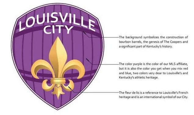
This Louisville City Logo got very strong ridicule from fans.

When a sports brand is faced with disapproval of a new logo they need to make quick decisions about how to control the damage. Often it is just par for the course, but in this rare occasion, a Louisville soccer team cuts the new logo design loose, and asks fans for their input. Perhaps a dangerous move, or perhaps a fantastic way to get fans to really connect to the brand!

Read more here: http://deadspin.com/fan-ridicule-leads-soccer-team-to-abandon-logo-1589224829

Monday, June 9, 2014

Check out these great Orlando City Soccer game matchup info-graphics on Instagram


Know of any other great sports matchup info-graphics? Please share in the comments. I wouldn't mind seeing a lot more of this kind of thing!