Sunday, September 1, 2013

Winsipedia - College Football stats like you have never seen before!

I am really excited to share this outstanding sports data site I recently discovered:

Winsipedia.com.


Winsipedia.com is a comprehensive collection of college football all time wins, in a visually stunning easy to compare format. The homepage (pictured above) also features some notable winning top fives including National Championships and Bowl Games. It also gives you a look at winning beyond the games with an NFL Draft picks and Heisman honors section.

The BEST part about this site, in my opinion, is the design and presentation of all of these great collections of data. See the beautiful bar graph below that shows the teams measuring up in terms of Heisman winners.


You may or may not be able to find this kind of info elsewhere on the web one way or another, but no where will you find it so easy to access, so comparable, and so consumable and ultimately useful anywhere else.

My favorite part of the site is the Compare Teams page. Here you can match two teams side-by-side and compare many aspects of their all time success. This feature alone could suck hours away from any college football fan who enjoys stats and rivalries. Below is an example of a match-up. I picked a rivalry that is close to my fan-hood.


With college football now in full swing for 2013, having this site on your bookmarks bar is a winning call, regardless of the "expert" predictions on your team. Check it out and share it with your friends. It is sure to be the kind of tool to inspire great smack talk, more accurate conversation and powerful bragging material!

Monday, August 19, 2013

Jacksonville Jaguars New Logo Design

Since my last post about the Dolphin's new logo, a friend asked that I discuss the new Jag's logo and of course I am very happy to oblige! 

Some obvious changes right off the bat from old to new are an overall more realistic look in the updated logo. Take the shape of the spots, for example: on the old logo they look unnatural and to me, quite frankly,  they resemble cheese doodles. 

I know comparing an element of the design to a cheese doodle in terms of shape is far from academic, however it is accurate as seen below:


Nothing about a cheese doodle is natural, including it's shape. So in general I am a fan of the new logo becoming more natural and organic in it's look and feel. 

You can see that the new spots on the Jag's head and face look like they have texture resembling fur, as well as a pattern that matches more accurately with the markings of the real life cat.  
I also like the fact that this logo found more ways to incorporate the teal color. Before it was only in the tongue, and now it is also in the nose and the eye of the cat. Because I think the unique color scheme of this team is a definite strength, I am happy to see more of both colors in the new design.

One strong element about the old logo that seems to be missing now is the emphasis on the whiskers. I'm ok with that because I am not sure why they chose to emphasize the cat's whiskers in the first place. Perhaps to use those arching lines to create more movement in the design, or more contrast behind the teal tongue? 

With the new design the mouth is bigger and more wide open, it also has a longer tongue. The mouth and teeth are now the emphasis of the design, which to me again is a significant improvement.

Another overall improvement for the brand and NFL as a whole with the Jacksonville rebrand. Let's see if this Florida team can take the improvements to the field and their record. 


Are you a fan of the new Jag's logo and helmet design?

Tuesday, August 13, 2013

Miami Dolphins Rebrand


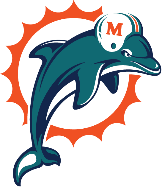
I know the Dolphin's released their new logo a while ago so this is somewhat old news, but I had yet to chime in about the new look here on SOD blog. The new logo has been a great conversation in my Web Design and Editing course at Full Sail University, where we focus the first week of study on design fundamentals, in order to give my sports marketing students a good foundation from where we can expand.

I have heard from some students and fans who love the new logo, and also from some who hate it.

Here are the top 3 reasons why I think the logo is a big improvement, and now one of the best logos in the NFL.

1. The body position of the Dolphin. 

Before: 


The dolphin's body in this logo is not in any kind of action position. He looks like he is just literally floating there, perhaps waiting for a wave or a sardine from the bucket.

After:


The dolphin's body in this logo is now in action! His body position suggests he might be in the air above the surface, perhaps having just jumped out of the ocean with the sun behind him at the peak of his launch.


2. No more helmet.

This was necessary. A fish in a helmet is just corny.

3. The circle of sun rays.

The orange circle of repeating sun rays behind the old dolphin were the same all the way around. By adding some variety in the scale of every other point, the logo gains visual interest while keeping the repetition.

Other mentionable improvements: the color tweaks, the general flatter look, and the improved overall balance.

Overall I think it is one of the top NFL logos because beyond the fact that it is a fantastic design, the icon symbolizes the team, the city and the fans appropriately and with the high level of style you would expect from a fashion and design hot spot like Miami, Florida. 

Congrats to the Dolphin's nation! I might just be Phins fan this year!

What do you think about the new Miami Dolphin's logo?


Wednesday, April 24, 2013

Fans will vote to choose the new College Football Playoff logo

Fans are definitely excited for the all new College Football Playoff, which starts as of now in over 616 days.

Now is a great time to figure out all the finer details like what the logo is going to look like.

I wondered when I saw the name if the logo might include the initials: "CFP". Then I found out that according to this article from the site, it will not.

"We decided to call the playoff what it is the College Football Playoff. We think the new playoff will be the most dynamic improvement to college football in a generation. Certainly it's what the fans want. We also invite everyone to vote online to select the logo and help us kick off the new College Football Playoff," said Bill Hancock, the Executive Director of the College Football Playoff.

Cast your vote for the official logo here: http://www.collegefootballplayoff.com

Before I looked at the results I had already decided that the compass logo was my favorite. All of them to me seem a little underwhelming, however.

Let's flip it for this blog post and find out which one the fans think is the worst. 


Which potential College Football Playoff logo do you think is the least impressive?


Friday, April 12, 2013

Tennessee Titans 15th Anniversary Logo contest

The Tennessee Titan's look to finalize their 15th Anniversary logo patch with help from the fans.

They have narrowed the selections down to four potential designs.  I am always stressing to my students the importance of the sports fan's connection to their team's logo. The idea of letting the fans pick the logo to me is so fantastic because of this. Imagine the connection one would feel to a logo they helped choose.

The voting is being done through a Facebook app, and each vote cast is a captured email address for the database.

Huge W for Titan's marketing team on this fan engagement campaign! 

Which one do you like the best?

 See the logos and vote here.