Tuesday, October 8, 2013

100 Greatest Pro Sports Logos Countdown - #97 Tampa Bay Lightning

#97 Tampa Bay Lightning

The Tampa Bay Lightning are a National Hockey League team in Tampa Florida.
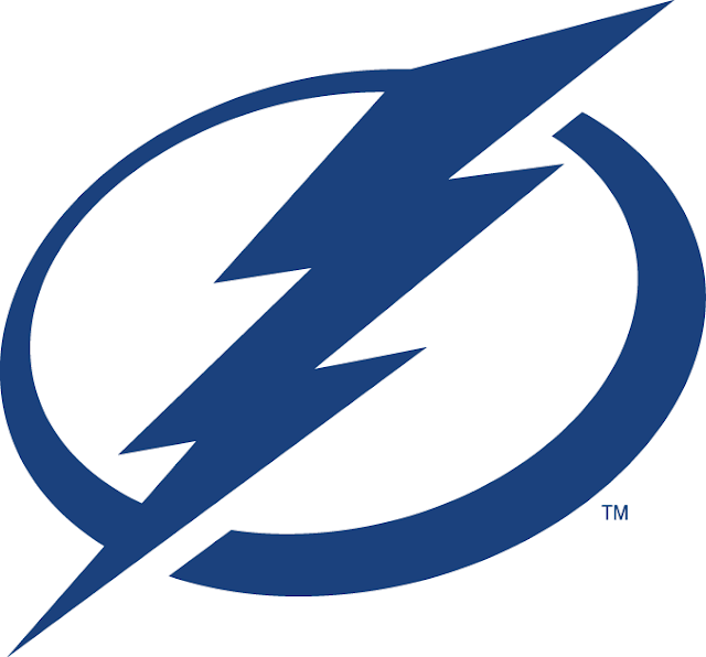

Logo referenced from Sportslogos.net

This logo is very simple and flat making it bold and versatile. The logo is used as the "O" in "BOLTS" and other words like "POWER" for purposes of brand consistency throughout the team's marketing creative. I like the simplicity of the logo and the varied thickness of the line that creates the circle around the lightning bolt making it look more like a puck. The Lightning have a fitting name for their sport and fan base with the word "Lightning" because it represents speed as well as the sometimes severe weather of the area. 

Continue the thoughts on twitter @sportofdesign or leave a comment below. Thanks for reading!


Monday, October 7, 2013

100 Greatest Pro Sports Logos Countdown - #98 Dayton Dragons

#98 Dayton Dragons

The Dayton Dragons, out of Dayton Ohio, are the Class A Affiliate of the Cincinnati Reds.


Logo referenced from Sportslogos.net

The Dayton Dragon looks to be a pretty ferocious mythical beast. I love the green they use for this logo because it's perfect for a dragon. I don't agree that dragons should be purple or red or black. To me a proper dragon is green, a reptilian green just like this one. The green works very well with the gold worked in sparingly. Nice typography and the scaly tail is a nice touch. This logo is fun and imaginative.  No doubt it has great appeal and is strong source of pride in the city of Dayton and around the Midwest.


Sunday, October 6, 2013

100 Greatest Pro Sports Logos Countdown - #99 Lake Erie Monsters

#99 - Lake Erie Monsters

 The Lake Erie Monsters are a professional ice hockey team in the American Hockey League.


Logo referenced from www.sportslogos.net

This AHL team logo from Cleveland, Ohio is particularly interesting to me because it is based on local folklore. The Lake Erie Monster, AKA Bessie, is the inspiration behind the logo and team name. Bessie has been sighted in Lake Erie for over 100 years by locals in the region and has become an important part of culture. A great story like that of Bessie behind a logo design can really make it unique and special. If I am ever in Cleveland, a Lake Erie Monsters tee shirt will be my choice of souvenir.


Saturday, October 5, 2013

100 Greatest Pro Sports Logos Countdown - #100 Brevard County Manatees

#100 - Brevard County Manatees

Milwaukee Brewers AA Minor League Baseball Team in the Florida State League.

Logo referenced from http://www.sportslogos.net

How adorable is this guy? I enjoy minor league logos in general because they are often cute and cartoony like this example chosen for the Sport of Design 100 Greatest Pro Sports Logos Countdown as #100.

Minor league baseball is the ultimate family hometown sports experience and there is nothing better then spending a nice evening out at a minor league ball game. Small crowds, stadium food, cold beer, friendly people... Kids running around everywhere laughing, chewing bubble gum and pretending to be big leaguers. It is a beautiful thing. This logo makes me happy in that same sort of way.


100 Greatest Pro Sports Logos Countdown


Sport of Design is very excited to announce it's very first top 100 countdown list:

The Sport of Design 100 Greatest Pro Sports Logos Countdown


The list will include logos from MLB, NHL, NFL, MLS, WNBA, NBA as well as any other professional teams or leagues including minor leagues, independent leagues and development leagues.

As a professor of design at Full Sail University in the Sports Marketing and Media Bachelor's Degree Program,  I discuss sports logos with my students and challenge them to seek out and discover interesting examples of sports logos from all corners of the sports world. We learn how to evaluate and critique design, color theory and typography through sports logos of all kinds in our class discussions.   After doing this with 10 plus groups I think I have seen some of the best and worst sports logos ever so I decided to see if I could come up with a top 100 of all time list.

The selections are based on my experience with sports design and of course my design opinion as well. The list is meant to be a fun review of the type of design I am most passionate about and in the spirit of healthy design debate and critique.

I would love to hear your feedback so please share your thoughts about the logos I have selected for the list. Thanks for reading and I hope you enjoy!

KC