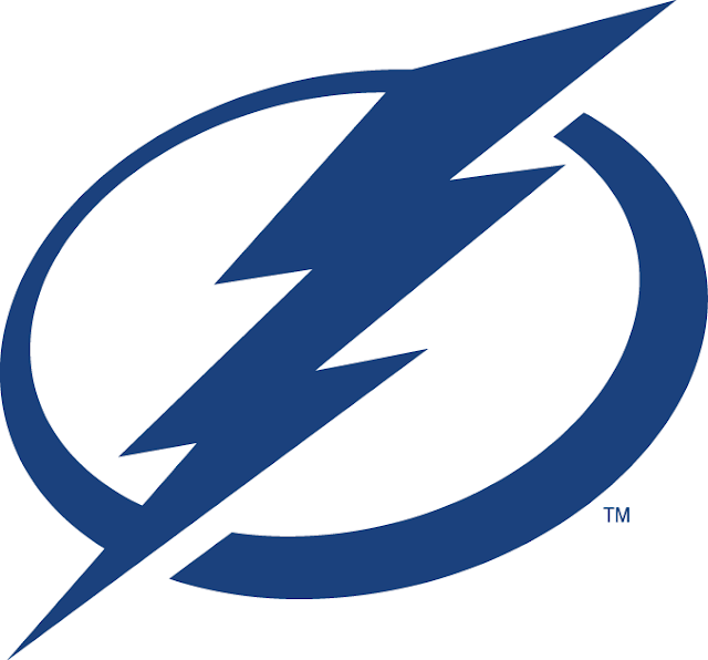
The Tampa Bay Lightning are a National Hockey League team in Tampa Florida.
Logo referenced from Sportslogos.net
This logo is very simple and flat making it bold and versatile. The logo is used as the "O" in "BOLTS" and other words like "POWER" for purposes of brand consistency throughout the team's marketing creative. I like the simplicity of the logo and the varied thickness of the line that creates the circle around the lightning bolt making it look more like a puck. The Lightning have a fitting name for their sport and fan base with the word "Lightning" because it represents speed as well as the sometimes severe weather of the area.
Continue the thoughts on twitter @sportofdesign or leave a comment below. Thanks for reading!


No comments:
Post a Comment