
I know the Dolphin's released their new logo a while ago so this is somewhat old news, but I had yet to chime in about the new look here on SOD blog. The new logo has been a great conversation in my Web Design and Editing course at Full Sail University, where we focus the first week of study on design fundamentals, in order to give my sports marketing students a good foundation from where we can expand.
I have heard from some students and fans who love the new logo, and also from some who hate it.
Here are the top 3 reasons why I think the logo is a big improvement, and now one of the best logos in the NFL.
1. The body position of the Dolphin.
Before:
The dolphin's body in this logo is not in any kind of action position. He looks like he is just literally floating there, perhaps waiting for a wave or a sardine from the bucket.
After:

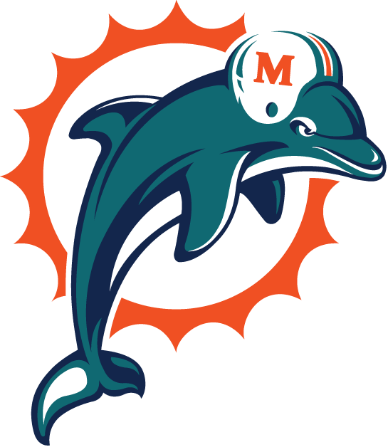
The dolphin's body in this logo is now in action! His body position suggests he might be in the air above the surface, perhaps having just jumped out of the ocean with the sun behind him at the peak of his launch.
2. No more helmet.
This was necessary. A fish in a helmet is just corny.
3. The circle of sun rays.
The orange circle of repeating sun rays behind the old dolphin were the same all the way around. By adding some variety in the scale of every other point, the logo gains visual interest while keeping the repetition.
Other mentionable improvements: the color tweaks, the general flatter look, and the improved overall balance.
Overall I think it is one of the top NFL logos because beyond the fact that it is a fantastic design, the icon symbolizes the team, the city and the fans appropriately and with the high level of style you would expect from a fashion and design hot spot like Miami, Florida.
Congrats to the Dolphin's nation! I might just be Phins fan this year!
What do you think about the new Miami Dolphin's logo?
No comments:
Post a Comment